Ethereum: The Merge
2023-01-17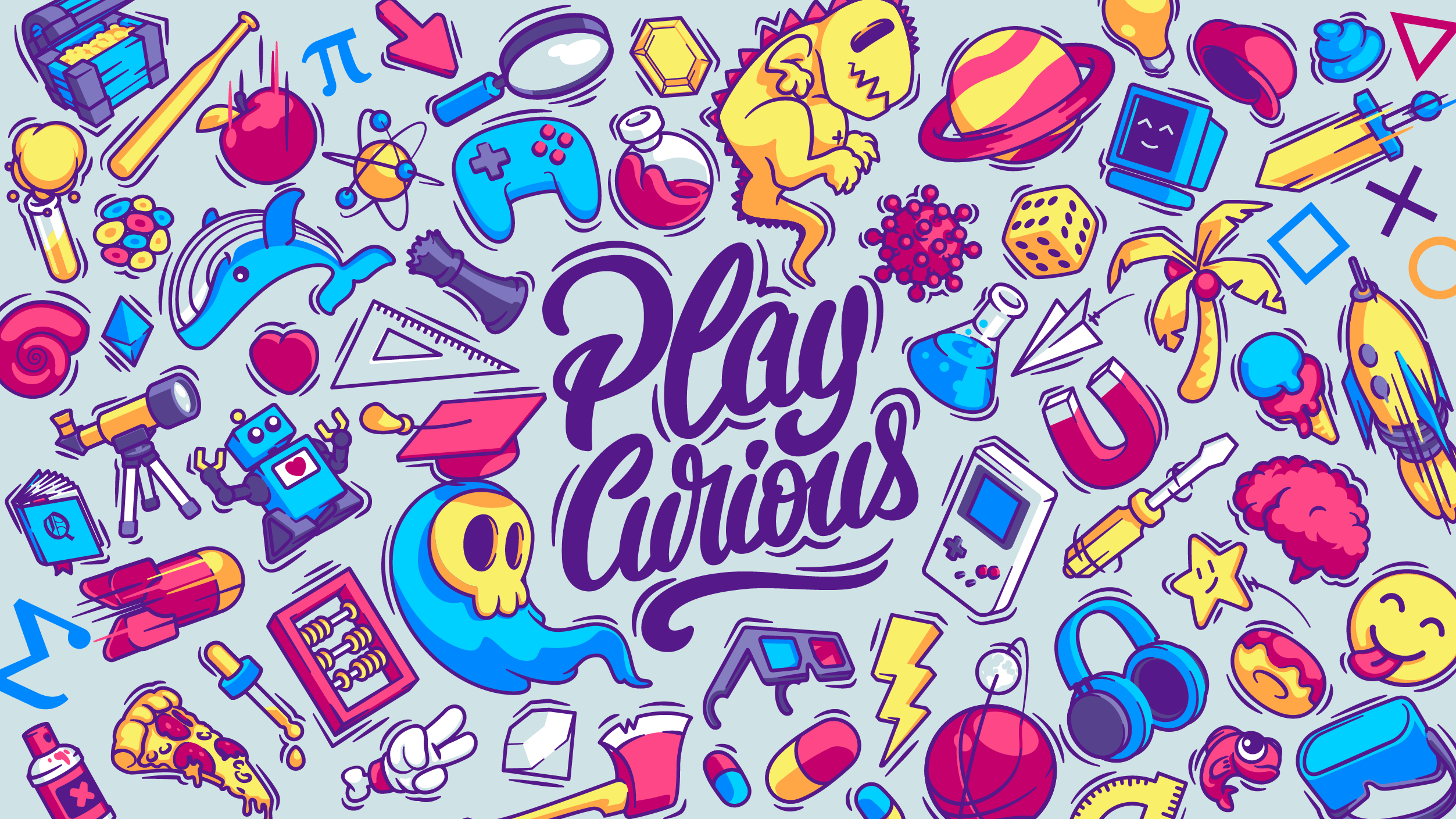
Une nouvelle charte graphique
2023-01-18A new logo for a new beginning
After a phase of intense reflection and 3 years of existence, Play Curious is reorganizing. Around this reflection we update our tools with their new colors. The change goes as far as the graphic identity of Play Curious.
Like any well-made identity, it starts with its logo...
Old vs New
"We worked in the continuity of the first logo, the idea is to accentuate what makes our identity"
The redesign of a logo is an important phase in the definition of a brand and its environment. The identity and the image that the logo gives off must synthesize our orientation.
For us the logo must :
- be identifiable at first glance (original?).
- transmit our state of mind.
- be human and welcoming.
The hand-drawn, hand-crafted side brings a lively and enthusiastic side to the logo, which are two characteristics that the team wishes to convey!
