A new logo for PlayCurious
2023-01-18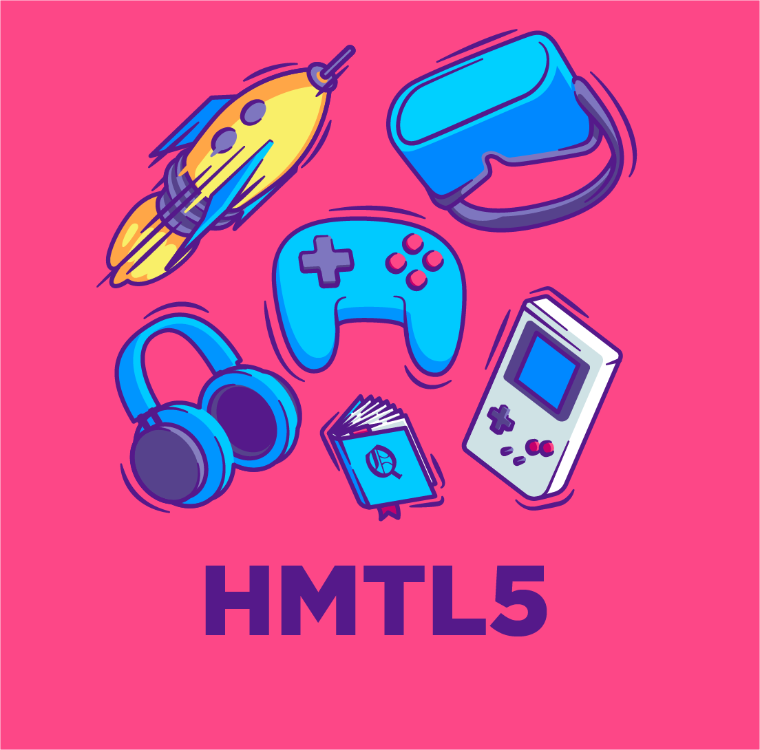
When everyone else uses Unity, why did we make our own custom game engine?
2023-02-01A brand new graphical design for Play Curious
Following the creation of the logo, we tackled the graphic charter and the associated elements. In the same spirit as for the logo, we want to highlight the specificities of the studio.
The baseline and its logo
It clearly explains our positioning and our objective. We modulate it according to the use of the logo (B2B, B2C presentation...).
The mascot"Mr. Curious"
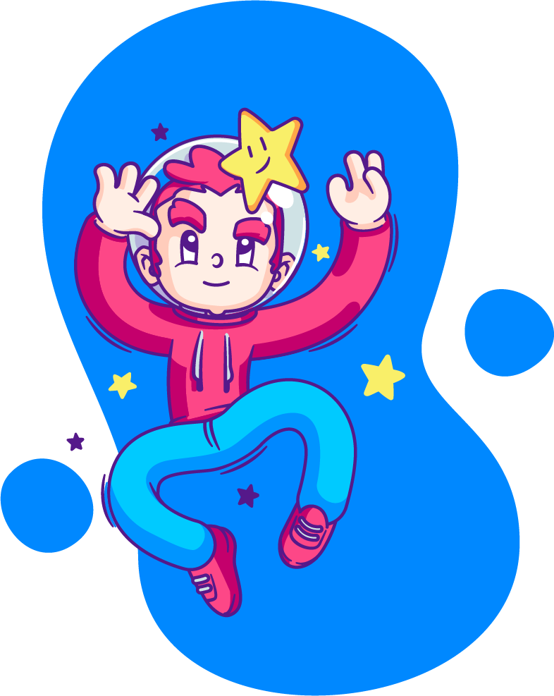
To further accentuate the human side, a mascot is a good option. It is representative of our vision. It also allows us to develop our sympathy capital... because we are really very nice ;)
The color palette

Lively and colorful like us, it allows us to unconsciously distill emotions, feelings and poetry.
Used in all the illustrations and in the graphic charter, they also allow us to distinguish ourselves.
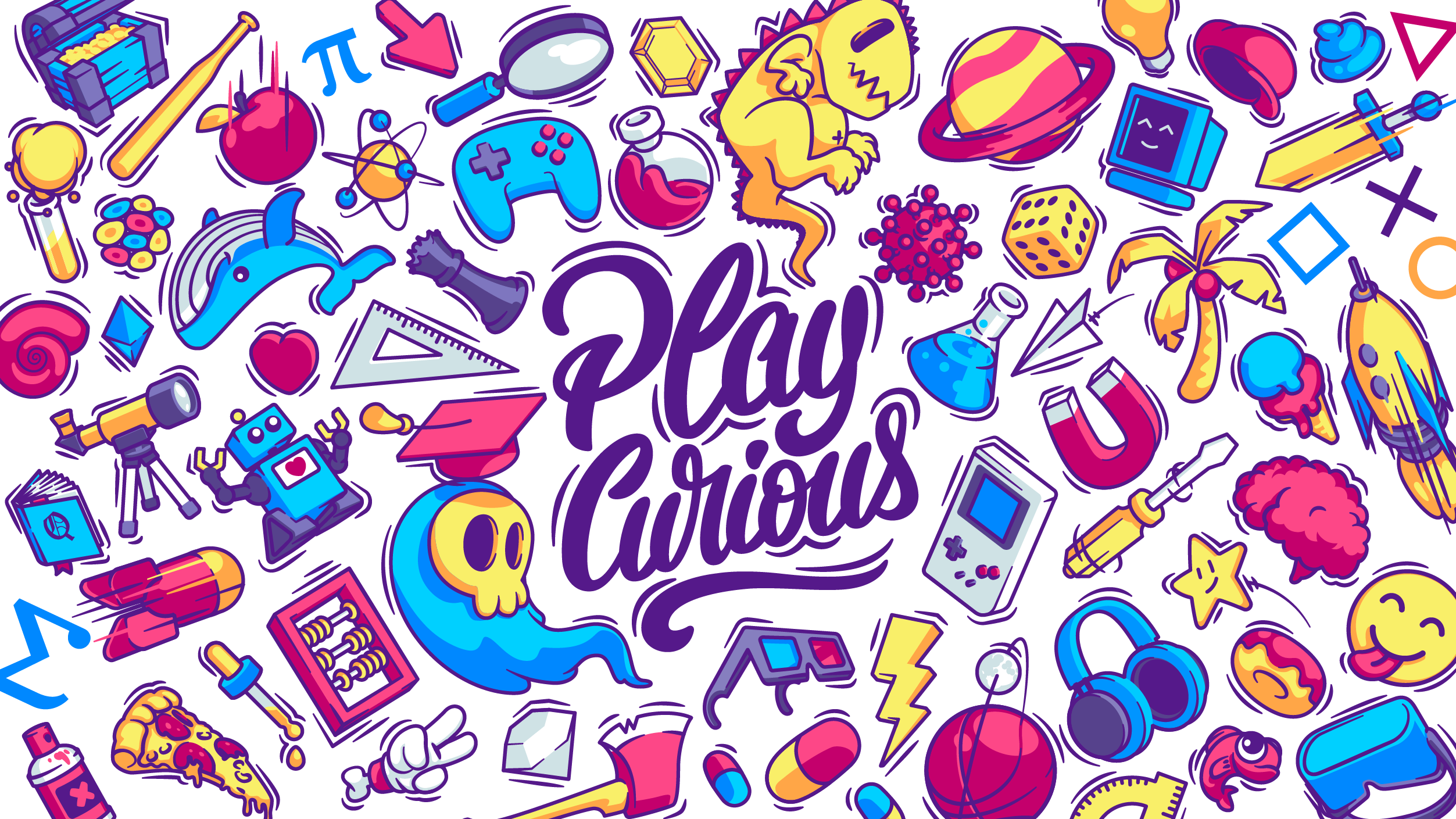
The icons and the key visuals
To show the field of the possible, we realized a key visual constituted by numerous illustrations / icons. Each icon defines an axis, a theme that we want to explore (physics, mathematics, history, chemistry...).
In short, our graphic charter outlines Play Curious. It defines us, identifies us, carries our values and helps us to convey our vision through our productions.
News and info aroundthe video game and marketing.
Get noticed by communicating through video games!
We accompany you from the reflection to the realization.
